Wednesday, February 20, 2013

Self Portrait Stencil

The purpose of this was to take a picture of yourself and then go into Photoshop and make it look like there are a certain amount of colors. We are going to be using this for a future stencil project.

Junk Shadow

For this project we had to take random pieces of trash and arrange it in a way that it made a shape when put in front of a light source. The most challenging part was to come up with an idea to make it look like something instead of just a blob of trash. This piece was successful because the shadow looked good and it made sense. After finishing I learned that you can make art out of anything even trash.

Value Scale

The purpose of this project was to pick a high contrast picture and then shade it using the value scale. This project was a good way to practice the value scale. The thing that didn't work for this project was that it was hard to find all the places where it changes color and how to make the transitions between colors seamless. If I could do this project again I would pick a different picture because the car was challenging since there are so many shades.After finishing this project I learned how to use the value scale correctly.

Thursday, February 7, 2013

Dragon

The purpose of this project was to select a picture and in Photoshop and change the number of layers so it only has a certain amount of colors and then change the saturation to make it greyscale.

Feather Shadow

For this project the purpose was to find a floating object with a top down view and put it into Photoshop to use the drop shadow effect to learn how to make shadows look realisitc and to give the illusion that the object was floating down. I used a feather and I made the shadow blurry to give it a more realistic effect.

Monday, February 4, 2013

Rhino Photoshop

This project was a good way to learn the basics of photoshop. The toughest part was to get the rhino selected perfectly so you could delete the background. After getting the rhino selected the rest was easy because then you could just drag him onto any background and then its easy to move him around or resize him.

Chick the Skeleton


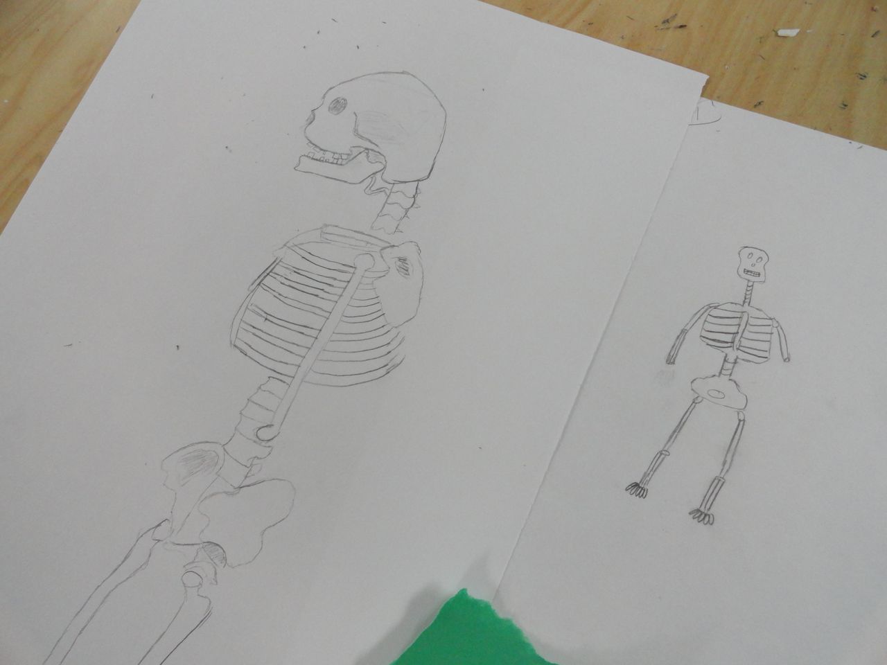
The second drawing of Chick was 378% better than the original one because I actually drew what I could see not what I was picturing in my head. The second picture is a lot more accurate because I paid attention to details instead of just trying to draw the basic shapes. I like the overall picture except I would try to make the head a little more skull shaped by making it protrude out more in the back. The most difficult part of the project was drawing it from the angle which I saw it from because it's harder to draw from the side than it is from the front. Overall I feel like I did a really good job drawing the rib cage, the spinal cord and the different pieces of the skull like the jaw bone unlike the first one where it looked like it would in a cartoon.